Responsive Web Design Explained: How Sites Fit Any Screen
Responsive web design keeps shop menus readable and buttons tappable on phones; learn what to check before choosing a theme that adapts to every screen.
In short
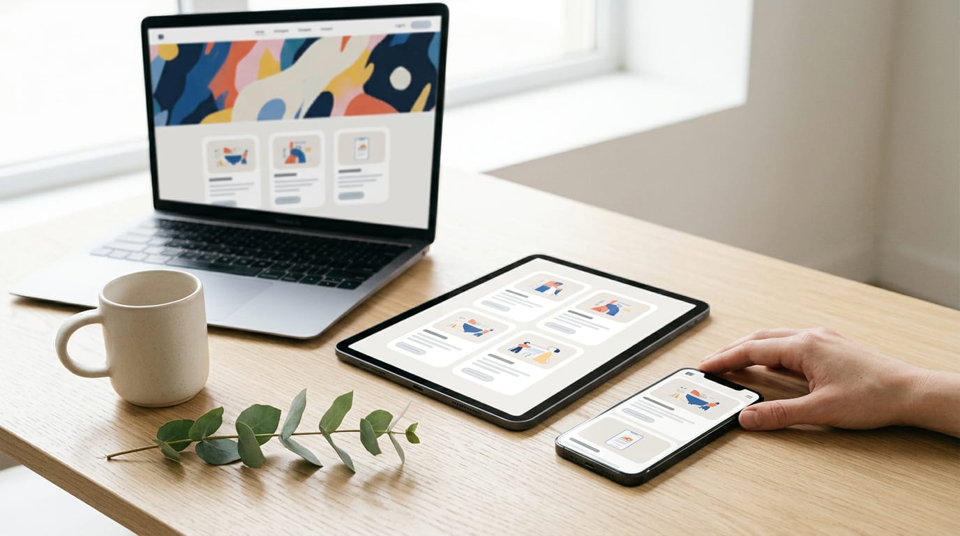
Responsive web design is an approach that makes one website adapt its layout to fit phones, tablets, laptops, and other screen sizes. Fluid grids, flexible images, and media queries help content stay readable and usable, while mobile-first layouts put essential information and actions where people can reach them. In practice, test a theme on narrow screens and real devices to catch cramped menus, oversized images, and hard-to-tap buttons before visitors do.
Picture a customer finding your shop on their phone while waiting for coffee. If the menu spills off the screen and the buttons are too small to tap, they’re gone.
That’s the problem responsive web design solves: a site whose layout rearranges itself to fit whatever screen it’s viewed on.
You don’t need to be a developer to get one. A theme can give you a responsive site without writing code, if you know what to check. Here, we’ll cover how it works, why it pays off, and a look-first path to choosing a theme that adapts.
How Responsive Web Design Adapts to Screens
Responsive web design lets one website reshape itself to fit any screen.
What is responsive used for?
Responsive design is used to keep your site working on every screen, since visitors arrive on phones, tablets and laptops. Instead of a separate mobile site, you build one that adapts, stacking a wide menu into a single column on a phone.
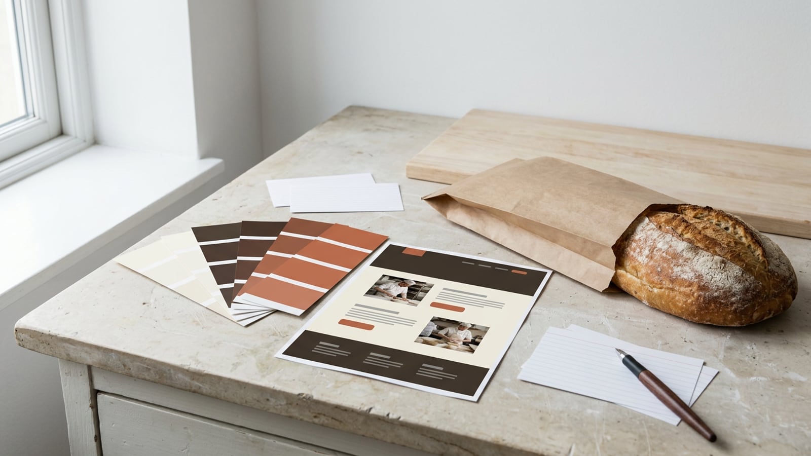
Think of a bakery owner whose customers check hours on the go. One responsive site gives them a readable menu on a phone and a roomier layout on the desktop, with the same branding on both. It also responds to user context, like the device in use.
The technologies that make it work
HTML5 (HyperText Markup Language, version 5) structures each page, CSS (Cascading Style Sheets) controls layout and look, and JavaScript adds interactive behavior. You won’t write this code, but we’ll explain the parts so you can judge demo sites.
Fluid grids stretch columns by percentage rather than fixed widths, and flexible images shrink to fit their space. Media queries are rules that apply styles at certain screen widths, and the points where the layout changes are called breakpoints.
Older tools like Flash and Silverlight have been dropped in favor of these standards.
How it became the industry standard
The shift picked up with the rise of smartphones and tablets, and by the early 2010s, desktop-first design was losing ground.
According to new data from StatCounter, mobile devices have overtaken the desktop as access points for the internet on a global basis. The question shifted from whether a site works on a phone to how well it does.
Today it’s a competitive necessity: a shop that only works on a laptop loses customers to rivals whose sites work everywhere. Adapt or fall behind.
The Main Principles and Techniques
Responsive design relies on several techniques working together.
Layouts that stretch and shrink
A fluid grid sets column widths as percentages, so two 50 percent columns widen on a laptop and narrow on a phone.
Relative units let a layout bend instead of break: em follows the surrounding text, rem follows the page’s base text, and absolute units like pixels (px) stay fixed.
CSS (Cascading Style Sheets, the code that styles a page) offers flexbox for rows and columns that wrap, and CSS Grid for whole-page layouts.
Media queries and where layouts change
A media query applies new styles only when a condition, like screen width, is met. A min-width rule applies from a set width upward, and max-width applies up to one. The points where the layout changes are called breakpoints.
Common breakpoint values cluster around phone, tablet, and laptop widths, like 600px, 768px, and 1024px.
Content-based breakpoints are often smarter: change the layout where your content starts to cramp, not at a number copied from someone else’s device list. Two or three breakpoints is typically plenty, since more usually means you’re fighting the layout.
Making images and media scale well
A fluid image shrinks to fit its container, so a wide banner never spills off a phone. SVG (Scalable Vector Graphics, drawings built from shapes instead of pixels) stays sharp at any size, so it’s the better pick for icons and logos.
WebP is an image format that often produces smaller files, and srcset (a list of image sizes) lets the browser pick the right one for each screen.
Lazy loading delays images until a reader scrolls near them, and object-fit controls how a photo fills a box of a different shape, cropping instead of stretching.
Getting the viewport, text and tables right
The viewport is the visible area of a screen. The viewport meta tag, a short line of code, tells phones to match that width so a desktop page doesn’t shrink into tiny text. Check that your theme includes it.
Fluid typography uses calc(), a built-in formula for combining units, and vw (one percent of the viewport width) so headings grow smoothly with the screen. Scrollable tables sit in a box that swipes sideways, so each column stays readable.
Start with the smallest screen first
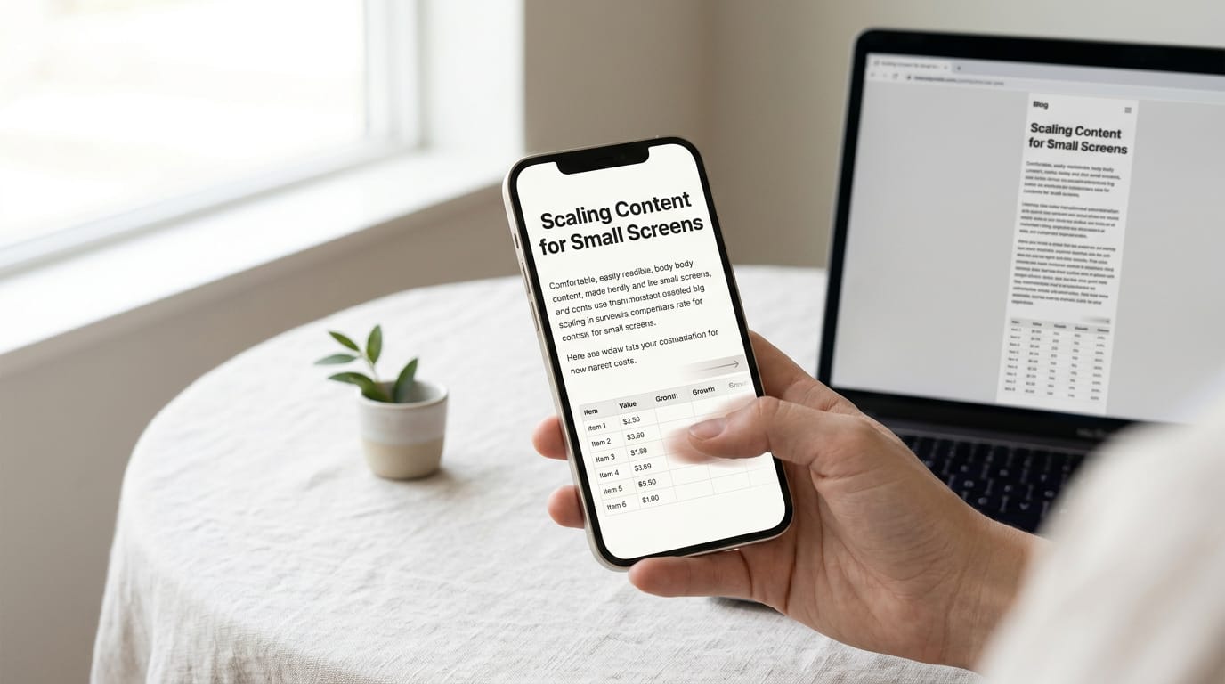
Mobile-first design builds the simplest layout for a phone, then adds to it for bigger screens. Space is tight, so prioritize essential content:
- what you offer
- how customers reach you
- the one action you want visitors to take
Think of a bakery owner whose phone page leads with opening hours and a big order button, so customers can order in one tap. On a laptop, the same site adds the full menu beside the photos without any rebuilding.
Enhancing for bigger screens relies on min-width media queries, where each rule adds changes as the screen grows. Phones get the simple version first.
How CSS positioning moves elements around
By default, every element sits in normal flow, the top-to-bottom order of a page. Positioning settings control how an element moves, and there are four main values:
- Static: the default, where elements stay in normal flow.
- Relative: nudges an element while its original space stays reserved.
- Fixed: pins an element to the screen, like a button that stays visible while scrolling.
- Absolute: places an element at a set spot inside its nearest positioned container, without making room for it.
Pulling elements out of normal flow can cause overlaps on small screens. Reserve it for things like a floating order button, and let content flow with the screen instead of fighting it.
Why Responsive Web Design Pays Off
Responsive design affects who stays on your site, who finds it, and what you spend keeping it up.
Easier reading and navigation keep visitors engaged
A site that reads well on a phone keeps people around long enough to act. Big buttons and menus a thumb can reach make up touch-friendly navigation.
Bounce rate, the share of visitors who leave after viewing one page, is the number to watch, and a real-world study on user engagement links responsive design to lower bounce rates.
Your fonts and colors stay put on every screen, so your brand doesn’t look like two different businesses.
Ranking better and reaching mobile users
Search engine optimization (SEO), the work of getting pages found, includes mobile-friendliness.
According to an article on Google’s new mobile ranking signal, mobile-friendly pages get a ranking advantage in mobile search results, and a clunky page elsewhere on your site can’t hurt the good ones.
Many of your visitors are on phones, and a laptop-only layout shuts them out. Take a wedding photographer who texts her portfolio link to a couple.
The couple gets one web address that works at the venue and at home, so every share points to one page. Your SEO work happens once, not twice.
Spend less time and money maintaining
Running one site instead of two saves you in a few ways:
- No separate mobile version. Nothing extra to build, host, or sync.
- One design to update. Change a heading font once and it updates everywhere.
- Cheap via CMS and frameworks. A content management system (CMS), the editing software behind your pages, and the frameworks it uses handle much of the responsive work.
- Future-proof for new devices. New screen sizes keep arriving, and a fluid layout, one that stretches with the screen, adapts without a redesign.
Less to build, less to fix.
Faster pages that convert more visitors
A conversion is any action you want a visitor to take, like buying or booking. According to a study on responsive design and user experience, companies that adopted it reported a 10% to 30% increase in mobile conversions.
Trust comes from consistency too: the same look everywhere feels dependable. Results from that study show that responsive design improves readability, navigation, and speed, though faster load times are a claim you’ll want to test on your own pages.
Best Practices and Design Choices to Weigh
Before you publish, run your plan past the seven C’s of website design, a checklist for whether each part of your site is doing its job.
Put the essentials first
- Essential content first. Lead with the main message and the main action up top.
- Reorder or hide non-essentials. Move sidebars below the main content, or hide them on phones.
- Progressive disclosure. Show the basics up front and tuck details behind a “Read more” link.
- Content-out approach. Let the words shape the layout, not the other way around.
- Minimalism. Fewer elements means less to load and less to get in the way.
Make buttons easy to tap
- Large tap targets. Make buttons big enough for a thumb, not just a mouse pointer.
- Adequate spacing. Leave room between links so one tap doesn’t hit the wrong one.
- Hover states on touch. Phones don’t hover, so a menu that opens only on hover stays shut.
- Touch feedback. Give each button a visible change when tapped, like a color shift.
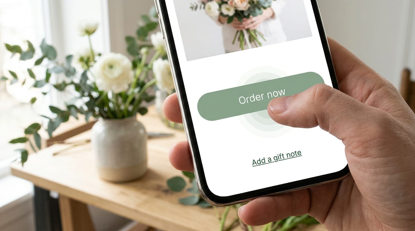
Picture a florist whose Order now button sits right above the gift-note link. Customers keep hitting the wrong one, and some give up. Bigger buttons and spacing fix that.
Plan layouts with sketches and prototypes
- Sketching layouts. Draw the phone and desktop versions by hand before opening any software.
- Wireframes. A wireframe is a plain blueprint of where blocks go, without colors or photos.
- Prototyping tools. Prototypes let you click through a mockup at phone width.
- Understand audience devices. Design first for the screens your readers use. If most arrive on phones, start there.
Type needs to flex too. Text that feels right on a laptop can feel cramped on a phone, so let font size and line spacing scale with the screen.
Layout patterns and speed tweaks
- Column drop pattern. On small screens, columns stack one below the other at full width.
- Compress images. Shrink image files before upload so pages load faster on mobile.
- Reduce HTTP requests. Every image, script, and style file triggers a separate HTTP (hypertext transfer protocol) request, so fewer files means a quicker page.
- Dark mode support. Check that text and buttons still read well in dark mode.
- Iterate on feedback. Ask a few real readers to try the site on their phones, fix what trips them up, and test again.
Tools and Frameworks for Building and Testing
Here’s what to reach for, how to test before visitors do, and which screen sizes to plan for.
Popular tools for designing and building
- Frameworks: Bootstrap and Foundation supply ready-made grids that stretch with the screen.
- Design tools: Figma, Sketch and Adobe XD let you mock up pages before anything goes live.
- Builders and themes: Webflow, Wix and WordPress themes build pages for you.
- ZURB Sketchsheets: printable paper templates for sketching layouts by hand.
If you’re wondering how to learn responsive web design, build one simple page, drag your browser window narrower, and fix whatever breaks. Reading teaches you the terms, but fixing a broken page teaches you how it works.
How to test across devices and browsers
Test before visitors do, starting with the browser developer tools in most browsers, which preview your site at different widths.
- Real-device testing: open the site on an actual phone and tablet.
- Cross-browser checks: load it in the browsers your visitors use.
- Orientation and OS variety: rotate devices and try both iPhone and Android.
Before you install a responsive theme, open its demo on your phone and turn the screen sideways. A wedding photographer who finds her gallery squeezed into one unreadable column moves on. Trust the phone over the sales page.
Screen sizes you should design for
- Mobile: the narrowest layout, so it’s the one to design first.
- Laptop: the middle ground between phone and desktop.
- Desktop: wide monitors, where sparse layouts look empty.
Breakpoints are the widths where your layout shifts, like a menu tucking into a button. Set them where your content breaks. Don’t copy them from a list of device sizes, since new devices keep arriving. Let the content decide.
Making Responsive Sites Accessible to Everyone
Accessibility means your site works for people who see, hear, move, or navigate differently. It’s less about how a page looks than whether everyone can use it.
Everyday habits for accessible pages
Start with contrast ratio, the difference in brightness between text and background. Pale gray on white may look elegant but is hard to read outdoors.
- Keyboard navigation. Menus, links, and buttons should work with the Tab key alone.
- Screen reader support. Headings and link text should make sense when read aloud on their own.
- ARIA labels and semantic HTML. ARIA (Accessible Rich Internet Applications) labels name icon-only buttons, and semantic HTML (the markup behind every page) uses real headings and navigation tags.
- Real text, not images of text. Typed text can be read aloud, searched, and resized. A picture of text can’t.
Think of a retired teacher starting her first blog. She tabs through her new theme’s menu and finds the search box skipped entirely. Catching that before launch keeps keyboard users from giving up.
Meeting the WCAG rules for layouts
The Web Content Accessibility Guidelines (WCAG) include rules that apply directly to layouts:
- Text resize. According to the W3C’s Web Accessibility Initiative (WAI), text must resize up to 200 percent without losing content or functionality. Captions and images of text are the exceptions.
- Reflow at 320px. A W3C WCAG issue thread on GitHub describes the rule: content must reflow at a width equivalent to 320 CSS pixels without losing information or forcing sideways scrolling. Narrow your browser window to check.
- Target size criteria. Buttons, links, and menu items need enough size and spacing that a fingertip can hit the right one.
- Reduced-motion preference. Some visitors turn on a device setting that asks for less movement. Check whether your theme honors it before you buy.
What Search and Speed Mean for Layouts
Two things matter here: which version of your page Google reads, and whether the page holds still while loading.
How Google reads your mobile version
A Search Insider infographic on mobile-first indexing puts it plainly: Google uses the mobile version of a site’s content for indexing (storing your pages so search can find them) and ranking.
So hidden mobile content is risky: anything your theme hides or drops on phones may be missing from what Google reads. What leads on a phone is an SEO (search engine optimization) decision, so put your key text first.
Preventing layout shift for Core Web Vitals
Cumulative Layout Shift (CLS) measures how much content shifts as a page loads. It’s part of Core Web Vitals, Google’s speed and stability metrics, and common causes are:
- images with no set size
- late-loading fonts
- banners added above existing content
Take a local bakery owner building their first site. Their ‘Order ahead’ banner sits above cake photos with no set size, so the page jumps and a customer taps the wrong button.
Declaring each image’s width and height reserves room before it arrives, and a fixed-height slot keeps the banner from shoving the text around.
Keep your font list short, since late-loading fonts can nudge text mid-read. Stability is the quiet half of speed.

Comparing CSS and JavaScript for responsiveness
Cascading Style Sheets (CSS) and JavaScript (JS) both reshape layouts. CSS keeps your words in the page and rearranges them, while JS can add, remove, or swap content by screen size, so anything arriving only through a script may load late or go missed.
Hiding isn’t the same as deleting. display:none (a CSS setting that hides an element from view) keeps the words in the page code. Check whether your theme’s tap-to-open tabs do the same.
JS also costs speed, since scripts that rebuild the page on every screen change make phones work harder.
How Responsive Differs from Adaptive Design
Both approaches aim for the same goal: a site that works well on a phone, a tablet and a laptop. They get there differently, and we’ll look at where they split apart.
Where the two approaches differ most
- Fluid vs. fixed layouts. A fluid layout uses percentages, so columns stretch and shrink with the browser window. Adaptive design relies on fixed widths for each screen size instead, so the layout jumps between sizes rather than flowing.
- One layout vs. multiple. Responsive design builds one flexible layout that adjusts to any screen. Adaptive design builds several fixed layouts and serves the one that matches the visitor’s device. Think of a bakery owner with a three-column price list. On a responsive theme, that list simply stacks into one column on a phone, and she doesn’t have to touch it.
- Maintenance differences. With responsive, you update one site. With adaptive, every change may need checking across each fixed version, which means more work and more chances for something to break. Fewer versions, fewer surprises.
- Best-suited use cases. Responsive design suits most blogs, online shops and business sites, where the same content should show up on every device. Adaptive can make sense when a project needs very different experiences per device, which is rarely a first-timer’s situation. For your first site, responsive is usually the right call.
Common Limits and Mistakes to Avoid
Responsive design looks simple on paper, but a few predictable snags catch nearly every first-timer. Here are the ones to watch for:
Challenges you will run into
- Easy nature is deceptive. A theme that works out of the box makes the job feel effortless, so it’s tempting to skip testing. A site that looks finished on your laptop can still look broken on a phone. Test on both.
- Less control over screen sizes. You choose the look, but the theme decides how it reflows on each screen. You can’t control every device your readers use.
- Elements shifting without media queries. Media queries are the rules that tell a layout how to change at set screen widths. Without them, a sidebar can drop to the bottom of a phone screen or a menu can squeeze into an unreadable column.
- Ad format issues. Ads can arrive in fixed sizes built for a desktop, so a banner may spill past the edge of a phone or shove your text out of place. Check your ad slots on a small screen before you publish.
- Horizontal overflow from fixed units. Fixed measurements, like a set width in pixels (the tiny dots that make up a screen), don’t shrink with the screen. A wide table or image can then push past the right edge, forcing readers to scroll sideways.
- Oversized photos break phone layouts. Picture a bakery owner whose full-size cake photos fill the entire phone screen and push the order button out of view. Resize images before uploading, and the page loads faster and keeps the button in sight.
Responsive web design boils down to one idea: the layout adapts to the screen in front of your visitor, not the other way around. Fluid grids, flexible images, and media queries handle the details, with breakpoints marking where the layout shifts.
When you choose a theme, look first. Narrow your browser window or open the demo on a phone, then check that the menu, images, and buttons still work. That quick test tells you more than any feature list, and it doesn’t cost a thing.
Start with the smallest screen, and you’ll find the rest falls into place more easily.
References
- Analyzing the Effectiveness of Responsive Web Design on User Engagement: A Real-World Study — doi.org (2025)
- The Impact of Responsive Design on User Experience — doi.org (2025)
- Mobile-First Indexing: What It Means (Infographic) — searchinsider.io (2026)
- Understanding Success Criterion 1.4.4: Resize Text | WAI — w3c.github.io
- 1.4.4 and 1.4.10 – Refresh or not? · Issue #4884 — github.com
- On a global basis, mobile internet usage surpassed the desktop in October — martech.org
- Google’s New Mobile Ranking Signal is on Page by Page Basis — thesempost.com
Questions
What is responsive used for?
Responsive design is used to keep a website readable and usable across phones, tablets, and computers. It adapts one site’s layout to different screens instead of requiring a separate mobile site.
What is responsive design for websites?
Responsive web design is an approach in which one website adjusts its layout and content to fit the screen it is viewed on. Fluid grids, flexible images, and CSS media queries help the site resize and rearrange across devices.
What are the 7 C's of website design?
The seven C’s are commonly defined as context, content, community, customization, communication, connection, and commerce. Together, they describe a website’s purpose and appearance, the information it provides, how users interact, and how it supports relationships and transactions.
How to learn responsive web design?
Start with basic HTML and CSS, then build a simple page and test it at different browser widths. Learn fluid layouts, flexible images, media queries, and mobile-first design, and use browser developer tools plus real phones and tablets to find and fix problems.
Sources
- On a global basis, mobile internet usage surpassed the desktop in October, martech.org
- Analyzing the Effectiveness of Responsive Web Design on User Engagement: A Real-World Study, doi.org,
- Google’s New Mobile Ranking Signal is on Page by Page Basis, thesempost.com
- The Impact of Responsive Design on User Experience, doi.org,
- Mobile-First Indexing: What It Means (Infographic) | Search Insider, searchinsider.io,
- Understanding Success Criterion 1.4.4: Resize Text | WAI | W3C, w3c.github.io
- 1.4.4 and 1.4.10 – Refresh or not? · Issue #4884 · w3c/wcag, github.com