Responsive Breadcrumb Explained, Start to Finish
Responsive breadcrumb trails show visitors where they are and how to step back. See where to place them and make them fit phone screens without custom code.

In short
A responsive breadcrumb is a short trail of links that shows where a page sits on a website and lets visitors move back to parent pages. It works best on deep, hierarchical sites, stays secondary to the main menu, and adapts on phones by shortening labels or hiding middle steps without losing the path. Keep it near the top, make links easy to tap, and identify the current page clearly so visitors can navigate with confidence on any screen.
Think of the “You are here” map at a big shopping mall. It shows where you’re standing and how to get back to the entrance.
A breadcrumb does the same job on a website: a short trail like Home / Blog / Recipes / Banana Bread that lets visitors step back up a level.
A responsive breadcrumb keeps working when the screen shrinks to a phone.
In this post, we’ll cover its parts, when it helps and when it doesn’t, where to place it, how to fit it on small screens, and how to get a working trail from your theme without custom code.
The Basics of a Responsive Breadcrumb
Ever wondered how a visitor knows where they are on your site? A breadcrumb is a short trail of links that answers that question and shows how to climb back up.
Why breadcrumbs show location and lead back
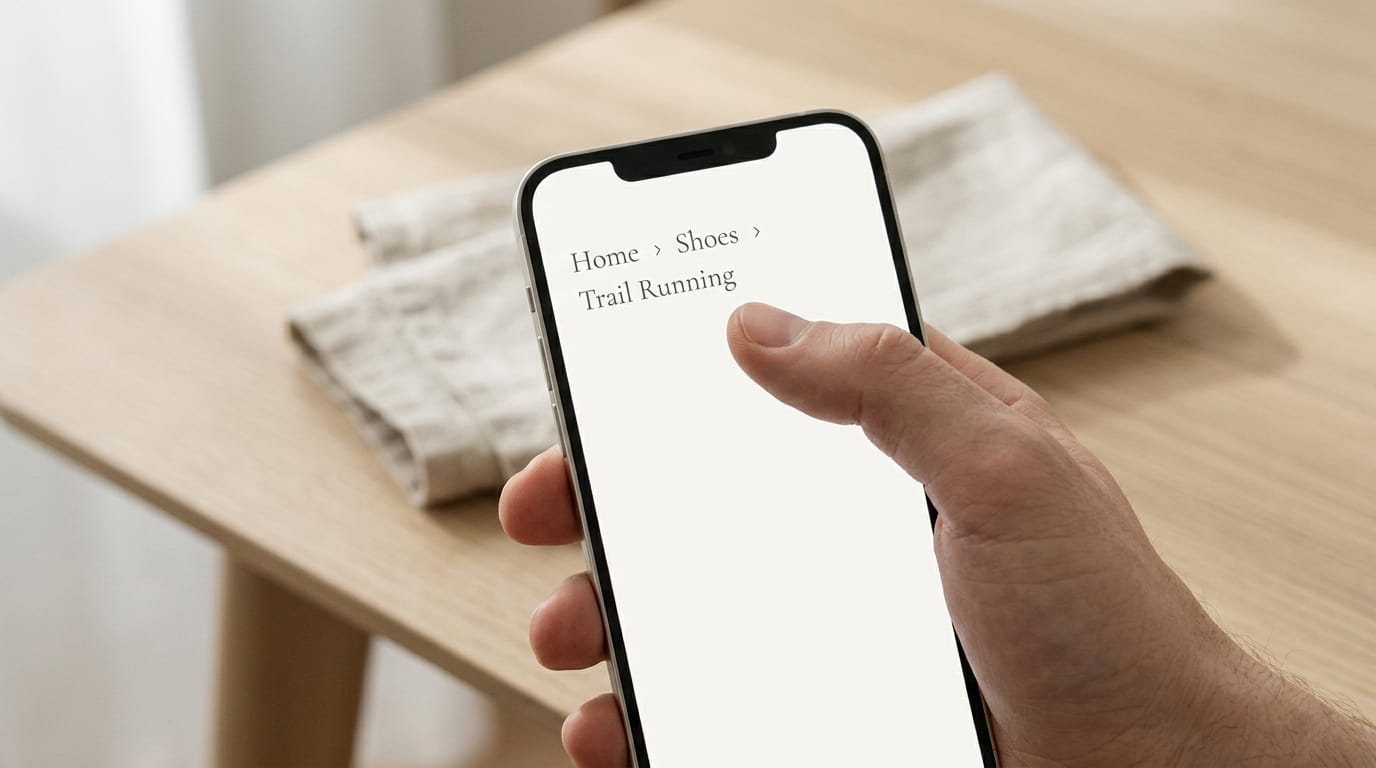
Picture a shop owner whose running shoe catalog is three levels deep. A shopper who lands on one pair from a search sees Home > Shoes > Running and taps Running in one move, not five Back presses.
The trail tells people where they are, not how they got there.
On deep sites, that trail also gives taxonomical context, showing where a page fits among your categories.
What is an example of a breadcrumb?
It’s usually a row of text labels or icons joined by separators, like Home > Shoes > Running:
- Items: the text labels or icons that name each level.
- Separators: the slash, arrow, or dot between items.
- Home icons: often a small house that stands in for the word Home.
Breadcrumbs come in three types: location (where a page sits), path (the route a visitor took), and attribute (filters picked, like Size 10).
How crumb links behave in each state
Each item in the trail is a crumb. Parent pages stay clickable so visitors can jump back up, while separators and the current page don’t respond to clicks. That’s by design.
A crumb can show four states:
- Default: the normal look of a clickable crumb.
- Hover: the change in look when a cursor rests on it.
- Active: the look while it’s being pressed.
- Disabled: a muted look for a crumb that can’t be clicked.
The current page also gets aria-current="page", a hidden label telling screen readers (tools for visitors who are blind or have low vision) which page they’re on.
When Breadcrumbs Help and When They Don’t
Does every page need a breadcrumb trail? Not every page does. A breadcrumb trail is the row of small links, like Home > Blog > Recipes, that shows where a page sits.
Sites where breadcrumbs earn their place
Breadcrumbs shine on multi-level hierarchical sites, where pages nest several layers deep. A hobby blogger with Home > Gardening > Vegetables > Tomatoes gives a reader who lands on a tomato post one tap back to Vegetables.
E-commerce (selling through an online store) and content-heavy sites gain too. A candle shop might use Home > Candles > Soy > Lavender, so a shopper on one lavender candle can jump to all the soy candles.
Breadcrumbs show where a reader is, not just how they got there.
Some themes add dropdown menus to each crumb, so that shopper can open a list of sibling categories and jump sideways. It’s worth checking that your theme offers this first.
Where breadcrumbs don’t belong
On a flat structure, with only a few top-level pages, a trail adds clutter without adding help. A freelance photographer with Home, Portfolio, Pricing and Contact can rely on the back button and main menu instead.
Breadcrumbs also aren’t a global navigation replacement. The main menu lists everything you offer; a trail only shows the path to the current page. They’re a supplement to the menu, not a substitute for it.
Multi-step processes call for Steps, a progress indicator that shows where someone is in the sequence. A church secretary building a three-step sign-up form needs readers to move forward in order, and a trail would let them wander off.
Browsing gets a trail. Finishing gets Steps.
Placing and Sizing Breadcrumbs on the Page
A breadcrumb trail is the row of links, like Home / Shop / Candles, that shows where a page sits on your site. Where it goes and how big its text is decides whether it helps readers or gets in their way.
Where the trail usually sits on a page
Most themes place the trail in one of three spots:
- Top left of the page, or top left of a content block
- Under the main navigation or the page heading
- Above a product image or title, which is common on shop pages
Think of a candle maker selling online. Her lavender candle page can show Home / Shop / Candles just above the photo and title.
A shopper who lands there from a search can tap back to the full candle collection in one click instead of hitting the back button over and over. Top left is the safe default.
Keeping crumbs quieter than the main menu
Breadcrumb text is usually set at 14px or 12px. Pixels (written px) measure text size on screen, and both sizes sit well below typical main menu text.
That’s the point: the trail should be quieter than the menu, not louder, so readers can find it without it competing for attention.
Many themes let you adjust size and color in the settings panel, and you usually don’t need to write code. Consider a retired teacher starting a recipe blog.
Her trail reads Home / Recipes / Soups in a light gray at 14px, so readers always know where they are while the soup photos stay in front. Small on purpose.

Making a Responsive Breadcrumb Fit Small Screens
A breadcrumb trail that fits neatly on a laptop can wrap into a jumbled stack on a phone. Here’s how to keep it short and easy to tap.
Hiding the middle of a long trail
A few patterns handle the middle:
- Meatball menu: a three-dot icon (the “meatball”) that opens the hidden steps.
- Show first and last two: keep the home link and final two levels visible.
- Overflow menu or wrap: extra steps tuck behind one button, or the trail wraps to a second line.
- Root included in the menu: the home link moves into the menu too.
- Parent-only back link: on the smallest screens, show just one link to the parent page.
Consider a florist whose trail reads Home, Bouquets, Mother’s Day, Pink Roses. A phone can show Home, a three-dot icon, then Mother’s Day and Pink Roses. Your goal is to hide the middle, not delete it. Shorter is kinder on a phone.
Shortening labels that won’t fit
- Ellipsis truncation: cut the label, add ”…”, and show the full name in a tooltip (a small pop-up). Touch screens don’t hover, so show the full name elsewhere too.
- Shorter alternative labels: “Pink Roses” beats “Hand-Tied Pink Garden Roses for Mother’s Day Weekend.”
- CSS text-overflow: ellipsis: Cascading Style Sheets (CSS) is the styling language behind your site’s look, and this one rule adds the dots automatically. Check your theme’s style options first.
- Short, accurate page names: vague labels like “Item 14” tell shoppers nothing.
Styling crumbs to resize with the screen
- max-width: 100% on the container: the trail can’t spill past the screen edge.
- Fixed height for a consistent look: keep it modest so wrapped labels don’t get clipped.
- Avoid fixed percentage margins: big margins set as percentages can squeeze a narrow phone.
- Adjusts to screen size: the trail shrinks or wraps as the screen does.
- Tap-friendly spacing: leave enough room between links that a thumb hits the right one.
Why crumbs move around on mobile
- Breadcrumbs misplaced on mobile: a trail stacked below a big image can end up out of sight.
- Position differs between desktop and mobile: check both before you publish.
- Moving above the product photo: shoppers see where they are before they scroll.
- Shopify theme customization: on Shopify, check the theme customization settings for placement.
A candle shop’s photo fills the phone screen, so a trail placed beneath it never gets seen. Moving it above the photo puts Home, Candles, Soy Candles right where shoppers look first.
Usability tips for crumbs on any screen
- Optimal placement and visibility: near the top, in plain sight.
- Responsive design in UX: a responsive layout adapts to any screen, and user experience (UX) is how easy a site feels to use.
- Reusable responsive components: build the trail once as a reusable block, so one fix applies everywhere.
Test it on a real phone.
Building Breadcrumbs into Your Code
Check your theme’s built-in breadcrumb setting first. If it’s missing, these routes need a little code.
Using ready-made components and their props
Ready-made components do the heavy lifting. Add a Breadcrumbs wrapper and an Item for each step, passing in props, the settings you hand a component. Versions exist for React (a JavaScript toolkit), Rails (a Ruby web framework) and Figma (a design tool).
The three props to know:
hreforto: the address each step links to, depending on your tool.className: a style name that matches the trail to your colors and spacing.children: the label readers see between the tags.
The label controls what readers see, but the address controls where they go. Get the links right first.
Building your own breadcrumb in React
Say a bakery owner’s birthday-cake page lives at /cakes/birthday. Her trail should read Home, Cakes, Birthday, so shoppers can step back to Cakes in one click. Building it takes four steps:
- Parse
window.location.pathname. That’s the browser’s record of the page address after your domain, which you split into segments like cakes and birthday. - Generate links per segment. Each link builds on the ones before it, so cakes points to
/cakes. - Capitalize segments and hide the last link. Cakes and Birthday get capital letters, and the final step stays plain text since you’re already on that page.
- Lay it out with Material UI’s Stack and Grid. Material UI is a ready-made React library. Stack lines items up in a row or column, and Grid handles layout across screen sizes.
Either way, check for BreadcrumbList structured data, extra labeling that helps search engines read how your pages connect. Confirm your theme or component outputs it.
A responsive breadcrumb is a small trail with a big job. It shows visitors where they are, gives them an easy way back up, and stays readable on the smallest screen.
You don’t have to write a line of code to get there. Start with what your theme already offers, check it on a phone, and adjust from there.
Keep the trail short and clear, and it’ll guide your visitors on any screen.
Questions
What are breadcrumbs in web design?
Breadcrumbs are short trails of links that show a visitor where they are in a website’s hierarchy and let them return to a parent page. They typically appear near the top of a page and supplement, rather than replace, the main menu.
What is an example of a breadcrumb?
A breadcrumb could be Home > Blog > Recipes > Banana Bread. Each parent label links to that level of the site, while the current page, Banana Bread, is usually not clickable.