How to Increase Website Conversion Rate, Step by Step
How to increase website conversion rate: set goals, find visitor drop-offs, and test fixes across landing pages, checkout, trust signals, and mobile speed.

In short
A website conversion rate is the share of visitors who complete a desired action, such as making a purchase, booking or signing up. To increase it, define and track goals, find where visitors drop off, then test focused improvements to pages, forms, product discovery, checkout, trust signals, offers, speed and mobile usability. The practical approach is an ongoing cycle of measuring, fixing friction and keeping changes that work, rather than relying on one big redesign.
Picture a small bakery with a busy sidewalk out front. Plenty of people walk past, a few peek in the window, and only some step inside and buy something. Your website works the same way.
Your conversion rate is simply the share of visitors who take the action you want, whether that’s a purchase, a booking or a signup.
This guide walks through the full process: setting goals, finding where visitors get stuck, testing changes, and fixing pages, checkout, and trust signals. We’ll also show how your theme’s look shapes each step, so your design choices help from day one.
Set Goals to Increase Website Conversion Rate
You need to know what success looks like before you change a single button.
What your conversion rate really measures
Your conversion rate is the share of visitors who take the action you want, like buying or booking a call.
Think of a first-time candle maker with 500 monthly visitors. Lift her rate from 2% to 3% and she gets 15 orders instead of 10 from the same traffic, so her return climbs.
Track macro conversions (big goals, like purchases) and micro conversions (smaller steps, like an email signup).
Click-through rate (CTR) measures how many people click your ad after seeing it. CVR (your conversion rate) measures who acts after arriving.
Calculating your rate and typical benchmarks
Divide conversions by total visitors, then multiply by 100. A bakery with 2,000 visitors and 40 online orders has a 2% rate.
The average rate falls roughly between 2 and 3%, but your own history is the better benchmark, so compare this January with last January.
Is a 7% conversion rate good? Usually yes, since it sits well above that average. Still, the direction of your rate matters more than any single number.
What does a 2% conversion rate mean? Two in every hundred visitors act. That’s typical, so treat it as a baseline to beat.
What is a good web conversion rate? It varies by industry, so measure your own starting point first.
Define conversions, set targets, track steps
- Define what counts as a conversion. Pick one main goal plus one or two micro goals.
- Set realistic targets. Aim a step above today, like moving from 2% to 2.5%.
- Set up analytics tracking. Confirm each goal is being recorded.
- Track key funnel events. A funnel is the path from first visit to purchase, so you can spot where people drop off.
Find Out Where Visitors Get Stuck
Before you change a button, find out where people get stuck. Here’s how we’d do that, from numbers to conversations.
Using analytics to spot funnel drop-offs
Your analytics tool (software that counts visits and clicks) shows how people move through your funnel, from landing page to checkout. Each step where they quit is a drop-off.
Look at three things:
- Segment by page and channel. Compare visitors who came from search with those from social media or email.
- Review funnel drop-offs. Find the step where most people quit, such as shipping costs at checkout.
- Track top pages and searches. Note your busiest pages and what visitors search for on your site.
Watching how people use your pages
Analytics shows what happened. Behavior tools show how it happened.
- Heatmaps. A color-coded map of where visitors click, tap, or hover. Cold spots suggest visitors aren’t noticing them.
- Scroll depth reports. They show how far down a page visitors scroll. If few reach your pricing, even a great pricing section won’t help.
- Session recordings. A replay of one visitor’s clicks and movements. A handful will reveal confusion you’d never see on your own.
Start with free heatmap tools. You don’t need to pay to begin, so watch first and spend later.
Hearing directly from customers and users
Data shows where people stall. Talking to them reveals why.
- Customer interviews. Ask past buyers what almost stopped them from purchasing.
- On-site surveys. A pop-up question like “What’s missing here?” catches people mid-visit.
- Moderated usability testing. You watch someone try a task, like booking, and ask questions as they go.
Think of a wedding photographer watching clients try to book. When several hunt for prices, she moves pricing to the top before launch.
Is five people enough? For this kind of test, it’s plenty. According to the Nielsen Norman Group (NN/G), a first study with five participants found 85% of the usability problems, and then you’ll want to fix them.

Auditing competitors and spotting friction
Your competitors’ sites are free research.
- Industry and competitor research. Try to buy or book on a few competitor sites, noting where you feel lost.
- Jakob’s Law. Visitors expect your site to work like the ones they already use. Be different in what you sell, not in how people navigate.
- Identify friction points. Friction is anything that slows visitors down, like a surprise shipping fee or a form with too many fields.
- Most-viewed FAQs. Check which frequently asked questions (FAQs) visitors open most, then answer them on the page where the question comes up.
Testing Changes to See What Works
Testing shows what works. Here’s how to test fairly and learn from losses.
How to run a clean A/B test
An A/B test pits page versions against each other. For a clean result:
- Two or more versions. Change one thing at a time to know what made the difference.
- Run it at least two weeks. Shorter runs catch flukes, not patterns.
- Statistical significance. The gap is big enough to be real, not chance.
- Sample size. How many visitors saw each version. Too few, and even a winner may be noise.
- Testing tools. Pick one that splits traffic evenly and records results for you.
On a low-traffic site, a split test may never reach a fair sample size. Try one bigger change and compare before and after. It’s less certain, but it still beats guessing.
Elements worth testing on your pages
Test what a page says before how it looks.
- Value proposition and copy. The headline explaining what you offer and why it matters.
- Call-to-action (CTA) color and placement. The button asking for the sale.
- Photos and descriptions. Clear images and specific details.
- Review positioning. Where reviews appear on the page.
- Guest checkout. Whether shoppers can skip creating an account.
Consider a florist testing a headline with an order deadline against a plain one. If the deadline wins, she keeps it and gets more checkouts.
Ranking ideas and learning from losing tests
Experiment velocity is how often you launch tests. Never stop testing. Visitors change, so make it a habit.
Rank ideas with an impact vs. effort framework: high impact and low effort go first.
A losing test shows what visitors don’t respond to, narrowing your next guess. Every test teaches you something.
Landing Pages, Buttons and Forms That Convert
This is where visitors decide to act, so every page, button and form counts.
Tightening landing pages for each ad
A landing page is the one page an ad sends visitors to. A wedding photographer’s engagement-session ad should land on a page about engagement sessions, with one booking button, so visitors can book without hunting.
Keep it about one offer, not everything you sell.
- Video: A short clip can show your work faster than text.
- Dedicated pages: Build one per ad channel, such as Google or Facebook.
- Match ad intent: Reuse the ad’s key words in your headline.
- Remove distractions: Hide the menu, sidebar and extra links.
- Noindex PPC variants: Add a ‘noindex’ tag to ad-only pages (PPC means pay-per-click), telling search engines not to list them.
- Pick conversion-ready theme layouts: You’ll want a theme with a full-width or landing-page template that drops the sidebar.
Writing buttons people actually click
- Action-oriented language: Start with a verb, like ‘Book’ or ‘Download.’
- Stand out visually: Use a contrasting color and plenty of space around it.
- One CTA per section: A CTA (call to action) is the button prompting the next step, so give each section just one.
- Give a reason: Add a ‘because,’ like ‘Get the checklist because it shows the mistakes to fix first.’
- Avoid ‘Click here’: Name the result, not the click.
Asking for less on your forms
Each extra field is one more reason to leave. A retired teacher starting a blog who only sends a monthly newsletter needs one field: an email. Asking for a phone number adds friction for no gain. Ask what you need, not what’s nice to know.
Try progressive profiling for longer sign-ups, which asks returning visitors for one new detail at a time. Shorter forms win.
Helping Shoppers Find and Judge Products
If you’re building your first store, shoppers ask one question: can they find it, and can they trust it?
Making search, filters and menus easy
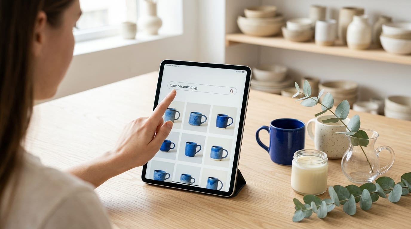
Start with site search, the box shoppers use when they know what they want. Fast, relevant results matter: “blue ceramic mug” should show mugs, not tote bags.
Add filters for size, color, or price, and make sure each one narrows the list.
Build categories around how customers think, not how you store inventory. A candle maker might use “Gifts for Mom” instead of “Soy Wax, Large Jar.”
Handle no-result searches too. A florist’s shopper who searches “peonies for a wedding” and finds nothing needs a next step, like “Try our bridal bouquets.”
What belongs on a product page
A product page helps shoppers decide:
- Benefit-driven descriptions say what it does for the buyer, not just what it’s made of.
- More photos and 360-degree views show every side. Show the item in use, not just on white.
- Detailed specs list size, materials, and care, so your buyer won’t have to guess.
- Scannable formatting uses short paragraphs and bold facts, since shoppers skim.
- Button placement above the fold keeps add-to-cart in the part of the page visible before scrolling.
Arranging listings and your homepage
The product grid is the tile layout shoppers scroll through on a category page. Match image sizes and prices so shoppers can compare at a glance.
A hero product is the big feature at the top of your homepage. One hero gives the eye a clear place to land; several rotating heroes split attention.
Picture a bakery launching holiday cookie boxes online. Feature the boxes in the hero spot, and the homepage answers “what’s for sale?” in seconds. One product, one clear answer.
Making the Cart and Checkout Smoother
Most buyers at checkout are ready to buy, so clear the path for them.
Cutting steps out of checkout
Picture a potter selling mugs online. If checkout asks for a phone number and a second address line, plenty of buyers will close the tab. Aim for shorter, not fancier. Try these changes:
- Shorter checkout forms. Ask only for what you need to ship and charge.
- Single-page checkout. Address, shipping, and payment sit on one screen.
- Progress bar. On multi-step checkouts, “Step 2 of 3” shows buyers how close they are to finishing.
- Guest checkout. Let people buy without creating an account.
- One-click checkout. Saved details let returning buyers pay with one tap.
Fewer steps means fewer exits.
Faster payment options and cart design
Offer the payment methods your buyers already use, like digital wallets, which store card details so shoppers don’t have to retype them. A slide-in cart shows the running total beside the page, so shoppers keep their place.
Add a prominent cart link in the header so buyers always find their order.
A bakery selling holiday boxes keeps its cart icon visible, so a customer who adds two boxes never has to hunt for the way back.
Bringing back shoppers who leave carts
An abandoned cart is one a shopper fills, then leaves without buying. Abandoned cart emails remind them what they left, and text message reminders, known as SMS (short message service), work the same way for shoppers who’ve opted in.
A modest discount code, used sparingly, can tip a hesitant buyer over the line. Social proof (evidence that other shoppers trust you, like real customer reviews near the cart) can help too.
Win them back with help, not pressure.
Earning Trust with Proof and Reassurance
Shoppers rarely buy from a site they don’t trust yet. Here’s how we’ll build that trust with proof from other buyers and reassurance about the purchase itself.
Showing reviews from real customers
Social proof from other buyers beats anything you write about yourself. A candle maker, for example, gains more from product-relevant reviews that mention burn time and scent strength than from a generic “Love it!”
Video reviews add a face and voice that stars can’t, and a short unboxing clip can settle doubts fast.
Gather everything on a dedicated reviews page and link to it from each product. Add customer photos and ratings too, since a snapshot of a real kitchen feels more believable than a studio shot.
Keep lower ratings visible: a few honest three-star reviews build more trust than a wall of perfect fives.
Reassuring buyers with guarantees and badges
Even a happy shopper can hesitate at checkout over one question: what if it doesn’t work out? A clear returns policy answers that before it’s asked. State the time limit, the condition and who pays return shipping.
Security badges only help when they’re real, so show just the ones your payment provider gives you.
Place a guarantee beside your call-to-action button, the checkout or order button. A bakery selling custom cakes, for instance, can add one line saying what happens if a cake arrives damaged, so a buyer who’s already decided stops stalling.
A money-back guarantee should be specific. A vague promise reads like marketing, but a specific one reads like a commitment. Specifics build trust.
Offers and Pricing That Lift Order Size
Once a shopper likes what you sell, the right offer or a clear price can close the deal. Here’s how to grow order size without cheapening your products.
Free shipping, discounts and time-limited deals
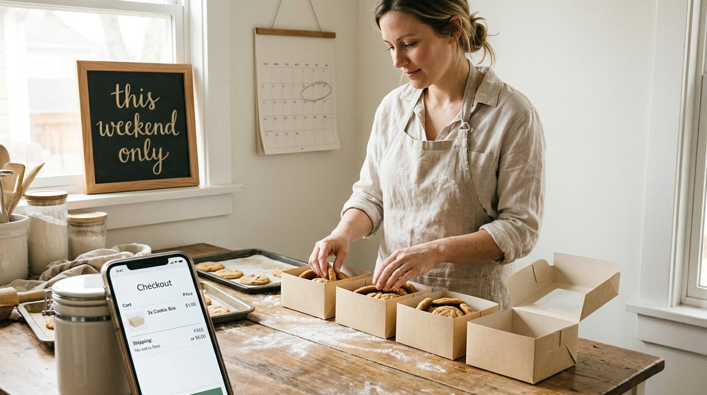
A surprise shipping fee at checkout is an easy reason to walk away, so a free shipping offer removes that worry. Picture a home baker selling cookie boxes online.
A first-purchase discount gets a new customer to try the product, and a free shipping threshold (free delivery once the cart reaches a set amount) nudges them to add one more box.
Limited-time incentives help too, but only if they’re honest. A weekend deal gives people a reason to buy now, but a sale that never ends stops feeling urgent.
Framing prices so savings stand out
The price matters less than how it’s framed. Price anchoring shows a higher reference price beside the sale price, so the deal reads as a real saving. A candle shop might strike through its regular price instead of showing one lone number.
To highlight savings, state them plainly, like ‘Save on this set today,’ so nobody has to do the math.
Suggesting add-ons and bundles shoppers want
Good suggestions feel like help, not pressure:
- Add-ons and bundles. Group items that naturally go together, like a candle and a matching holder.
- “Frequently bought together.” Show related products right on the product page.
- Cart and checkout recommendations. Offer one small extra in the cart, and keep checkout simple.
- Personalized suggestions. Use what a shopper viewed or bought to recommend items, like a streaming service picking its next show.
Take a local florist selling bouquets online. A bundle of flowers, a vase and a card turns three purchases into one click. One click beats three.
Chat, Pop-ups and Personalized Content
A visitor with a question on your site rarely sends you an email before leaving. They just close the tab.
Answering questions with live or AI chat
Picture a candle shop owner whose visitor asks if she ships to Canada. A live chat puts a real person on the line, while AI chat, which uses artificial intelligence (AI), replies automatically at any hour.
Contextual chat scripts open with a greeting that fits the page, like offering plans on the pricing page. When a bot can’t solve a problem, a seamless human handoff moves the conversation to a person without making anyone repeat themselves.
The goal is to answer questions in the moment, not deflect them.
Triggering pop-ups on exit or time spent
Exit-intent triggers fire when the cursor heads for the close button, which is a good moment for one last offer. Time-on-page triggers wait until a visitor has been reading for a while, and that’s a sign of real interest.
Reports put the conversion lift from well-timed pop-ups at 4 to 10%, though your results will vary.
A bakery owner might offer a free cookie recipe to someone about to leave the order page. Keep each pop-up to one offer. Pop-ups should help visitors decide, not pressure them.
Showing content tailored to each visitor
Dynamic content swaps parts of a page based on what you know about each visitor. A new visitor might see a “Start here” block, while a returning visitor sees where they left off.
A freelance photographer can show past clients her wedding packages first, so they skip the portfolio they’ve seen. Personalized recommendations take it further, like suggesting a matching scent after a shopper views a vanilla candle.
Keeping the Site Fast and Mobile Friendly
A visitor stuck on a slow page or a tiny menu rarely stays long enough to buy.
Speeding up pages and auditing for errors
Page load time is how long a page takes to appear, and every extra second of waiting invites a visitor to leave. Resize images before uploading and turn on caching (saving a copy of your page so repeat visits load faster).
Aim for pages that feel quick, not pages that just score well in a report.
Next, check for broken links, which send visitors to missing pages. One on your checkout page is a sale that quietly disappears. Run a site audit tool to flag slow pages and broken links, then fix the worst first.
Making mobile browsing and buying easier
Your buyers will likely reach you on a phone too, so a site that only looks right on a laptop puts sales at risk. Picture a candle maker whose customers browse during a lunch break. If the Buy button sits three screens down, that shopper gives up.
Test it yourself: open your site on your own phone and try to buy something from start to finish, noting every spot where you pinch, scroll sideways, or tap the wrong thing. It’s free, and it shows you what visitors see.
Navigation matters just as much. According to Google’s Ads Help guide to optimizing for mobile, your mobile site “should make it quick and easy for visitors to perform common tasks such as contacting you, searching for a product, or making a purchase.”
Your theme matters too. Check the demo on your phone, not just your laptop, and make sure the layout is responsive (it adjusts to fit any screen) and the menu collapses cleanly.
Raising your conversion rate comes down to a simple loop: know your number, find where visitors stall, test a change, and keep what works.
You’ll repeat that loop as your shop grows, and small, steady fixes to your pages, forms and checkout usually add up more than one big overhaul.
If you’re choosing a theme now, pick one with a clean layout, readable buttons and quick loading, so every fix has a better chance to work.
The look keeps people around, and the clarity gets them to act.
References
- Why You Only Need to Test with 5 Users — nngroup.com
- Optimize your website for mobile — support.google.com
Questions
What is CTR and CVR?
CTR, or click-through rate, is the share of people who click an ad after seeing it. CVR, or conversion rate, is the share of visitors who complete a desired action, such as making a purchase or signing up.
Is a 7% conversion rate good?
Usually, yes. A 7% conversion rate is well above the typical 2% to 3% average, though what counts as good varies by industry and by the action being measured.
What does a 2% conversion rate mean?
A 2% conversion rate means that 2 out of every 100 visitors take the desired action. It is a typical baseline, but compare it with your own past results and look for ways to improve.
Sources
- Why You Only Need to Test with 5 Users - NN/G, nngroup.com
- Optimize your website for mobile - Google Ads Help, support.google.com