Comment Thread Design: A Complete Guide to Layout
Comment thread design can turn readers into participants. See how comment layouts, nested replies, controls, and writing boxes fit your theme.
In short
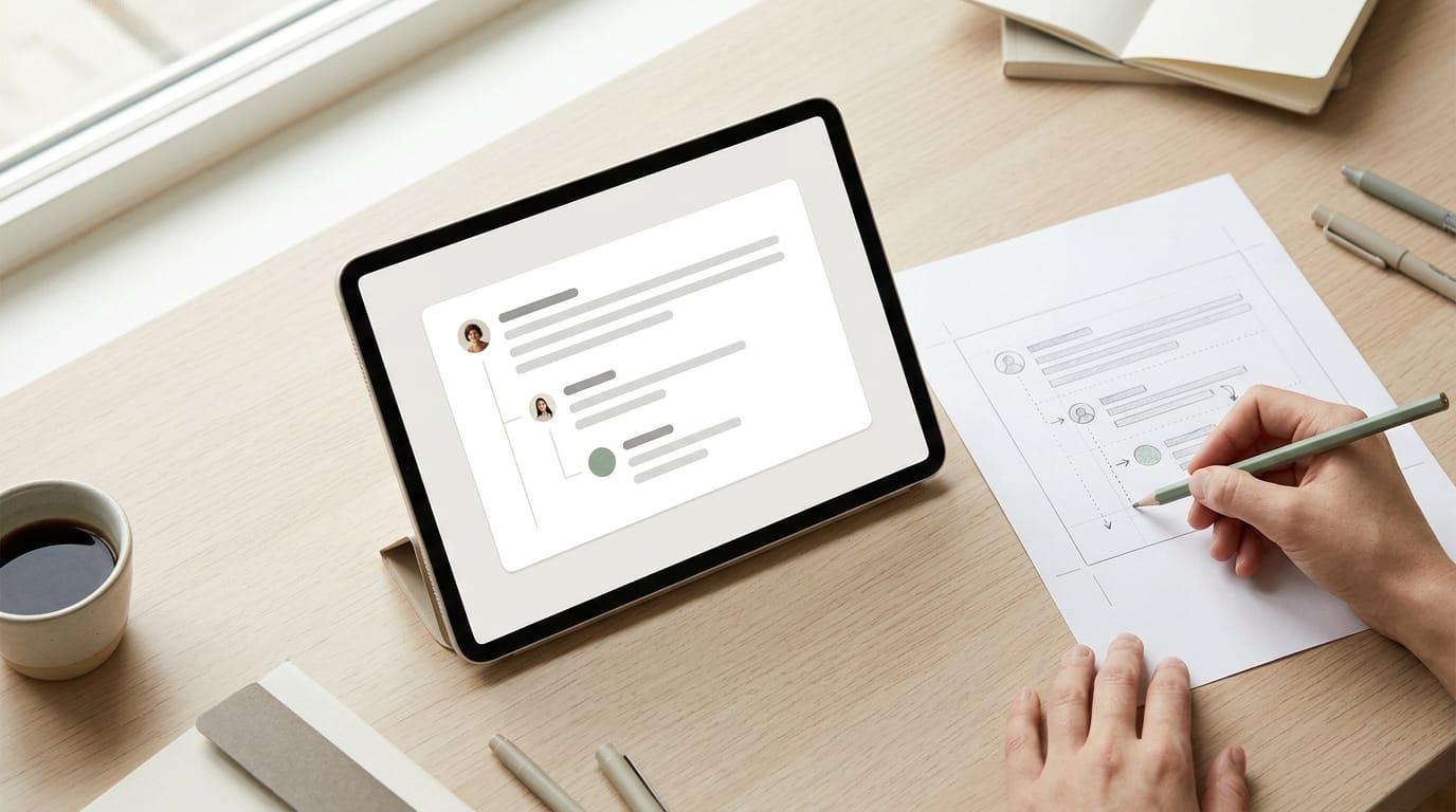
Comment thread design is the way replies, controls, and the writing box are arranged so people can follow and join a conversation. Use clear comment groupings, limited indentation, compact thread-wide controls, and an input that matches posted comments, while making every action work with keyboards and screen readers. Keep the site’s existing visual style, check the layout on phones, and refine only what makes replies easier to read and use.
Picture a good dinner party. Someone asks a question, a few people chime in, and the talk splits into side conversations that still make sense.
A comment thread works the same way: it’s the list of replies under a post, and its design decides whether readers join in or quietly scroll past.
We’ll cover each comment’s layout, nesting and replies, thread-wide controls, and the box where people type. Then you’ll see how to match a look to your theme without a designer.
Why Commenting Matters for Comment Thread Design
Comments are where readers talk back, and their layout decides whether they bother. Before you pick a look, see why commenting matters and where older designs fell short.
How commenting shapes social and work life
Think of a retired teacher who blogs about container gardening. Her readers swap tips in a comment thread, the running list of replies under a post. In social life, it’s less about whether readers can post and more about how easily they can follow along.
Commenting is also a basic tool at work. Teammates leave feedback on shared drafts, and a tangled thread means a useful suggestion gets lost. Sharing needs responses too: every share invites a reply, so the thread has to be easy to join.
Where the old component fell short
The older component had real limits:
- Restrictive for new functionality. It was hard to extend, so adding anything new meant working around it.
- Poor screen reader handling. Screen readers, the software that reads a page aloud for people who are blind or have low vision, could struggle to tell where one reply ended and the next began.
- Weak keyboard navigation. Many people use the Tab key rather than a mouse, but the old layout didn’t always let them jump between replies or reach the reply box.
- Not responsive in design. A responsive layout adjusts to the screen’s size. The old one often didn’t, so replies got squeezed into a narrow strip on a phone.
Consider a wedding photographer whose gallery draws replies from couples, many of them on their phones. If the thread is cramped or hard to use from a keyboard, couples give up and take their booking inquiries with them. That’s a lost booking.

Laying Out Each Individual Comment
Each comment works best as a small, self-contained card.
Grouping the avatar, name, and timestamp
Keep the avatar (the small profile picture), name, and timestamp on one row, which frees up vertical space. Stacked on separate lines, they’d turn a thread into a long scroll.
Then let the text run full width, edge to edge. Picture a retired teacher’s book club blog where a member posts three thoughtful paragraphs. Full-width text reads as one comfortable block, not a skinny strip.
Set it in your theme’s body font so comments look like part of the page.
Why the left thread line can go
Many comment sections draw a vertical thread line down the left to show which replies belong to which comment. It eats width you’d rather give the words, especially on a phone.
Stacking already implies the grouping: a reply sits under its parent, so readers see the connection from where it sits, not from a drawn line. No line needed.
Indentation shows the nesting depth, but each step costs width. Cap it at two or three levels, and on mobile use smaller indents so the words keep their room.
Moving edit and delete into a menu
Edit and delete get used now and then, but many themes show them as bright link-style buttons under every comment. Tuck them into a kebab menu instead: the three-dot icon that opens a short list. It helps in three ways:
- Calmer threads. Fewer buttons compete with the words.
- More tab-friendly. Keyboard users press Tab once for the menu, not once per button.
- Familiar app pattern. Most people already know three dots from their phone apps.
A bakery owner answering a dozen comments a day can fix a typo from the menu, not from a row of buttons under every reply.
Controls That Apply to the Whole Thread
Some controls sit above every comment, so they shape the whole conversation. Sorting, pagination (splitting comments into pages) and load-more (a button that fetches the next batch) belong here too.
Replacing the subscribe switch with an icon
The subscribe switch is the on/off toggle that lets readers get notified about new replies. On a phone, a full-width switch eats screen space the replies should own. A small icon button does the same job in a fraction of the room.
Picture a wedding photographer whose pricing post draws a long run of replies. A bell icon keeps those replies in view while readers still follow along. Match the icon’s style to the rest of your site so the thread doesn’t look pieced together.
The saved space can also hold a copy-link action, so a reader can grab a direct link to one reply. The goal is to save space, not features.
Making resolve look like a real button
Resolve marks a question thread as answered. As a faint text link, it’s easy to miss, and a check mark makes it look already finished. Readers skip what looks done.
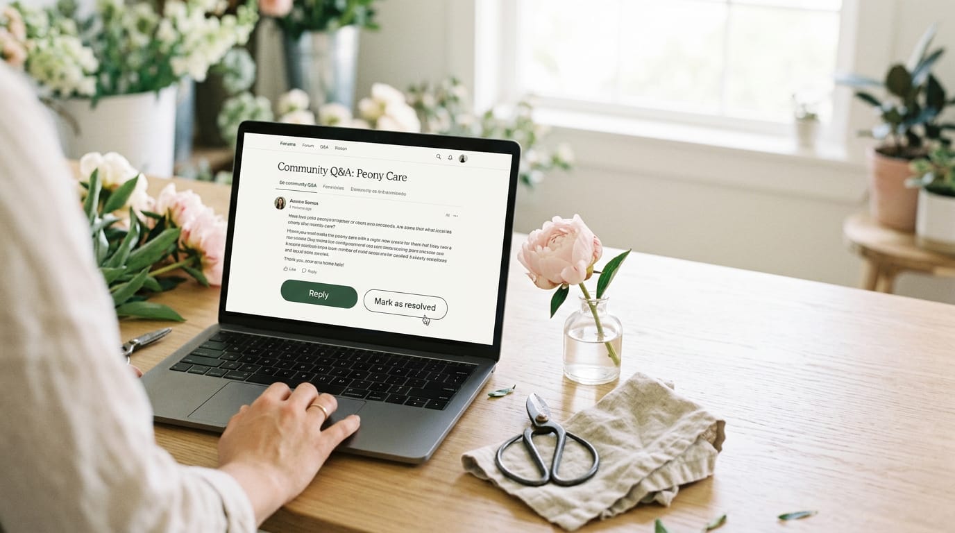
Consider a florist running a question thread on peony care. Without a clear control, answered questions blend into open ones, and new visitors can’t tell which answers worked.
Swap the check mark for a secondary button, a bordered or softer style that reads as clickable without competing with your reply button. Label it with an action, such as “Mark as resolved,” so people know what tapping it does.
It should look like a button, not a link.
Designing the Box Where People Write Comments
The comment box is where a reader decides whether to join in, so it deserves a close look. Here’s how to make it feel easy from the first click.
Making the input match a posted comment
A good comment input should feel like the comment it’s about to become, not a form you’re filling in. Think of a bakery owner whose sourdough blog gets a steady stream of questions.
A reader finishes a post, scrolls down, and sees a box that looks like the replies above it. No pause, no guessing.
- Remove the user avatar. Hide the small profile picture beside the box so the input lines up with the comment text above it.
- Full-width input. Stretch the box across the whole comment column instead of a narrow strip tucked to one side.
- Matches submitted comment appearance. Use the same font, text size and spacing as a posted comment, so what readers type looks like what goes live.
- Less jarring experience. A box that looks out of place makes readers stop and wonder, and that pause costs you replies. Familiar wins.
Don’t forget the states. An empty box can show a short placeholder such as ‘Share your thoughts.’ While a comment posts, a small ‘Posting…’ note confirms the click worked. If posting fails, say so plainly and keep the typed text in place.
Picture a retired teacher whose long reply vanishes after she hits Post. One clear error message would have saved her from retyping the whole thing.
Assembling the Component in Design Tools
Start by checking the comment styling WordPress already gives you, then work from one reusable version of the thread.
Reusing one Figma component instead of copying
In Figma, a design tool, you can turn a finished comment into a component: one master piece you place wherever it’s needed. Picture a local bakery owner mocking up a blog post with a customer comment and two replies.
Build the block once and reuse it rather than copying it by hand. Here’s what that gets you:
- Avoid copy-pasting conversations. Pasted copies drift apart, and you end up fixing the same spacing three times.
- Responsive and easy to manipulate. Edit the master and every copy follows.
- The thread extends automatically. Add a reply and the layout grows to fit it.
- Faster mockups of the comment user interface (UI). Once the component exists, a full thread comes together quickly.

Small refinements instead of a total overhaul
Most owners don’t need a redesign. Aim for refinement, not revolution: keep the fonts, colors, and spacing that work, and adjust only what looks off.
Subtle but important changes, like a deeper indent for replies or a lighter divider line, can make a thread far easier to follow. Consider a retired teacher whose book review blog shows replies that look just like top-level comments.
A slightly deeper indent and a thin divider separate them, and the blog keeps every font it already uses. Clearer conversations, no redesign.
Put the original and the tweaked version side by side, then keep a change only if the after reads more clearly than the before. If it doesn’t, undo it.
Making Comments Easier for Everyone to Use
Comments only help if everyone can join in, including people who use a keyboard instead of a mouse or a screen reader instead of their eyes. Here’s what to check before you settle on a look.
Supporting screen readers and keyboard users
A screen reader is software that reads a page out loud, and many people depend on one, or on the keyboard alone, to get around. Think of a retired teacher whose book blog gets a thoughtful comment from a reader who relies on a screen reader.
If the comment form has unlabeled fields and the reply option is just a small icon, that reader may never find where to type. Fix those labels and that reader can join the discussion about next month’s reading list. Here’s what to get right:
- Screen reader handling. Every field needs a visible label, and each comment should be read in a sensible order: author, date, text, then the reply option.
- Keyboard navigation. Readers should reach every link, field, and button with the Tab key, moving in the same order the items appear on screen.
- Menus easier to tab through. Keep dropdown and reply menus short, and make sure they open and close from the keyboard so nobody gets stuck inside one.
- Test text contrast on comments. Contrast, meaning how far apart the text and background shades are, is what makes words readable. Pale gray text can look polished and still be hard to read, so check that comment text, names, and timestamps stand out clearly.
Your readers shouldn’t have to squint. The goal is a comment section that’s easy to use, not just easy to look at.
Good comment design isn’t about adding features. It’s about making every reply easy to follow, every state easy to read, and every moderation choice feel fair. When those pieces work together, people stop skimming and start talking.
You don’t need a designer to get there. Start with the look your theme already uses, borrow its fonts and spacing, and check the thread on a phone before you publish. Get the thread right, and the conversation takes care of itself.