GuidesChapter 2 · Website Builders
Website Footer Guide: What It Does and What to Include
A website footer puts key links and details where visitors are ready to act. See what to include, how to lay it out, and a checklist to build yours.
In short
A website footer is the section at the bottom of every page that gives visitors a reliable place to find contact details, key links, legal information, and next steps. Keep it simple, group a few useful links under clear labels, prioritize readability and mobile accessibility, and include only genuine, current details and trust signals. A well-planned footer helps people act or navigate without hunting, while footer links help search engines find pages but matter less for rankings than links in page content.
Think about the fine print at the bottom of a good flyer: the phone number, the opening hours, the little logo. Nobody reads it first, but the moment someone needs it, that’s where they look.
A website footer is that same strip along the bottom of every page of your site, holding the links and details people reach for when they’re ready to act.
Here, we’ll cover what a footer does, what to put in it, how to lay it out well, and a simple look-first checklist for building one in your own builder.
What a Website Footer Does for You
The footer is the strip along the bottom of your site, and it’s easy to treat as an afterthought. Here’s where it sits and why we should care.
Where the footer sits on every page
Lists of website parts run long, but for placement you only need three zones:
- a header on top
- the body in the middle
- the footer along the bottom
Because the footer repeats on every page, it’s the one spot visitors can count on.
Your copyright notice and other fine print usually go here too. It’s not required, but many visitors expect one, so it’s worth a few minutes.
How the footer keeps visitors engaged
Its consistency keeps your site feeling like one place, so visitors stop hunting for things. It also signals the end of a page.
Since it’s often the last thing visitors see before they leave, it’s a gentle spot to invite them further, like a link to your newest post.
What sends visitors down to the footer
Visitors head down here with a few needs:
- Contact info and hours. A florist who’s closed Mondays lists her hours in the footer, so a customer planning a Tuesday pickup finds the answer without calling.
- Pages missing from the main menu. An About page or shipping policy can live here without cluttering your menu.
- Legal information. Privacy policies and terms belong where people look for them.
- Credibility checks. A business address and a named owner show a real person stands behind the site.
- Where to go next. Links to your best pages give readers a clear path forward.
How footer links help search engines
Search engine optimization (SEO) is the work of helping search engines find and rank your pages. Footer links get crawled, meaning search engines follow them, so listing your key pages there helps them get indexed, or added to search results.
Still, footer links carry less weight than links within your content.
According to a Search Engine Land guide to link equity, links in the main content area can transfer more equity, the ranking value a link passes along, than those buried in footers or sidebars. So the footer is about finding pages, not ranking them.
Don’t stuff it with keywords. A crowd of search terms reads as spam. Keep it human.
What to Put in Your Footer
The footer runs along the bottom of every page, and it’s where visitors look when they can’t find what they came for.
The basics every footer needs
Start with these five essentials:
- Contact details: an email or phone number you actually check.
- Logo or business name: so people always know whose site this is.
- Grouped navigation links: main pages sorted under headings like “Shop” and “Help.”
- Social media links: only for networks you still use.
- Copyright line: the copyright symbol, the year, and your name.
Those five are enough to launch with. Consider a freelance designer who goes live with just these. A client who scrolls down finds her email in seconds, and that’s the payoff.

Links that help people move around
The secondary navigation is the set of footer links that supports your main menu, such as “About” or “Returns.” Repeating a few header links here is fine, since some visitors check the bottom first.
Your logo should link back to the homepage, and a back to top link gives phone users a one-tap trip to the top of a long page.
Extras that prompt visitors to act
A call to action is a short nudge, like “Book a free call.” Footers suit one because readers who reach the bottom are already interested. Common extras include:
- Newsletter signup: collects emails from readers who want updates.
- Contact form: lets people reach you without opening their email app.
- Popular or related posts: give curious readers somewhere to go next.
Pick a couple of these rather than every one, so the footer doesn’t compete with your page.
Legal links and trust signals
Visitors also scan the footer for reassurance. A privacy policy explains how you handle people’s information, and your terms set the rules for using your site.
Show security badges, certifications, and affiliate or award logos only when they’re genuine and current, since a badge you can’t back up undercuts trust. Add disclaimers too, such as a note that your content is for general information only.
If you use artificial intelligence (AI) tools to write or edit, a short AI policy tells readers how you use them.
A cookie consent link lets visitors manage cookies, and a General Data Protection Regulation (GDPR) link explains how you handle personal data.
Location details and visual extras
Add your address or a map if you have a physical spot, and opening hours so nobody has to ask whether you’re open Sunday. Images and galleries add personality, so keep them light, like a small strip of photos.
A language or region switcher helps when you serve visitors in more than one language or country.
Picture a neighborhood bakery that lists its address, a map link, and Saturday hours. Customers find the answers without calling, so the owner stays at the oven instead of the phone.
Clutter to keep out of footers
The footer should be quieter than the rest of your site, not louder. Leave out:
- Every site page: a footer that links everything turns into a maze.
- Keyword-stuffed text: packed search terms read as spam to visitors.
- Abandoned social icons: remove any network you stopped using.
- Heavy embeds and autoplay: a video that starts on its own slows the page and startles people.
- Overcrowding and clutter: too many links and badges make everything harder to find.
Clear beats crowded every time.
How to Lay Out a Footer Well
A footer is the strip at the bottom of every page, and planned well, it’s a handy map. Here’s how to build one that works for everyone.
How to arrange footer columns and links
- Three to five columns, with four to seven links each.
- Labeled link groups like “Shop,” “Help” and “About,” so visitors know what’s inside.
Overflow goes to a hub page, one page listing everything in a crowded group. Some larger stores use a fat footer, a wide block of many links, but for a first site, aim for scannable rather than exhaustive.
What does a footer look like?
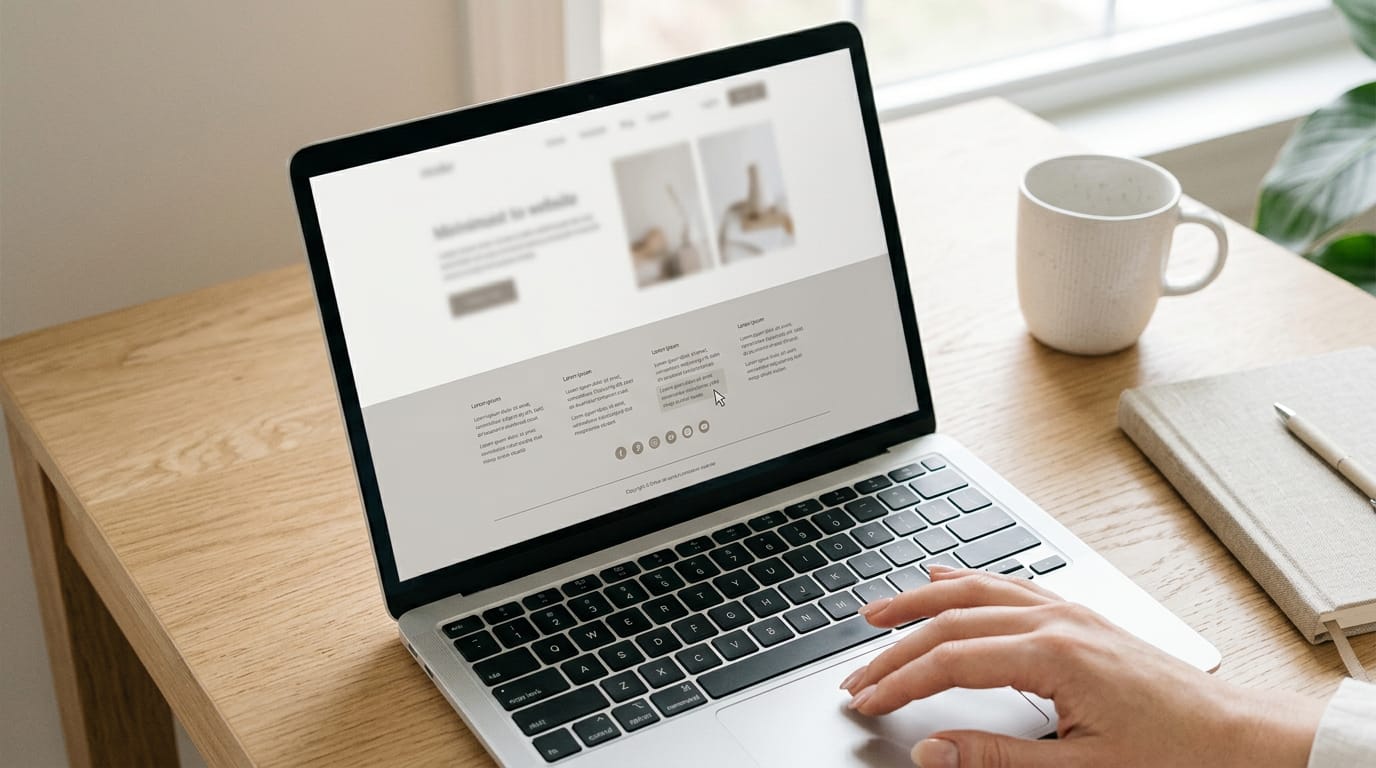
A good footer is simple and uncluttered: a plain background, a few columns, and a logo or copyright line. Picture a bakery whose footer lists hours, a phone number, and an order link, so customers find answers in seconds.
According to a research paper on WCAG 2.0 colour contrast, the Web Content Accessibility Guidelines (WCAG) specify a minimum contrast ratio (the brightness gap between text and background) of 4.5:1 for normal text.
Pale grey footer text? Test it before you publish.
Make links easy to read and space them generously. Empty space isn’t wasted space.

Making the footer work on phones
On phones, columns stack into one long list. Stack them by importance: contact details and top links first, legal fine print last.
Use accordions, tap-to-expand menus, for long link groups. Make each tap target (the area a thumb presses) big enough to hit easily, and keep contact and legal links visible instead of tucked away.
Think of a freelance photographer whose client needs her number outside a wedding venue. Put it at the top of the stack, and the client calls in one tap.
Keeping it usable for all visitors
Check that your builder wraps the footer in a true footer element. Screen readers, the tools that read pages aloud, announce it as a footer landmark, a region visitors can jump to.
Give each link group a visible label, like “Help.” Add an accessible name (the text read aloud) to any icon-only social links, so a florist’s Instagram icon is announced as “Instagram.”
Finally, check for visible focus states: the link a keyboard user is on should show a clear outline.
Footer Ideas for Each Kind of Site
The right footer depends on who’s scrolling down and what they came to do. Here’s what we’d put there for each kind of site.
What online stores put in the footer
Shoppers here want answers more than products. Make these easy to find:
- Shipping and returns: A plain-language page on delivery times, costs, and returns.
- Order tracking: A link so buyers can check on a package without emailing you.
- Payment icons and trust badges: The payment types you accept, plus any security logos your provider supplies.
- Customer service and live chat: Your email or phone number, plus a chat button if you use one.
A one-person candle shop that adds a shipping cutoff and a tracking link can expect fewer “where’s my order?” emails.
Tech products and their footer links
Tech sites use the footer as a map to everything else.
- Product, resources, and company columns: Group links into three short columns so nobody has to hunt.
- Docs and API links: Point developers to your docs and your application programming interface (API), which lets other software connect to yours.
- Status page or roadmap: A status page shows whether the service is running. A roadmap shows what’s next.
- Security certifications: Link any you hold to a badge or a page that explains it.
Local businesses and agencies
For a local business, the footer does some of a receptionist’s job.
- Address, phone, and hours: Match these exactly to your listing so visitors never see conflicting details.
- Directions and booking button: A map link and a button to book or request a quote.
- Review profile links: Links to where customers already leave feedback.
- Closing CTA and selected work: End with a call to action, like “Book a consultation,” plus a few projects that show your work.
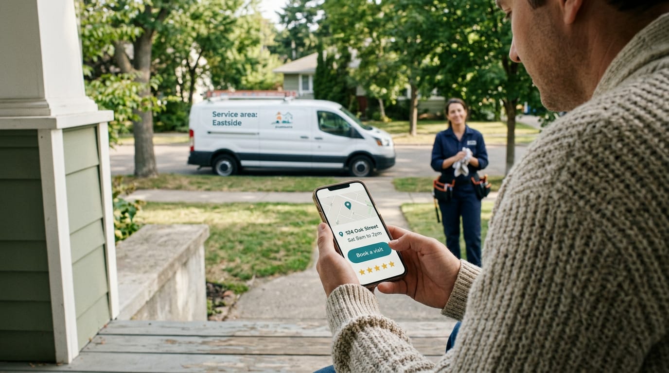
A plumber with one van lists her service area and weekend hours, plus a “Book a visit” button, so callers stop asking whether she’s open Saturdays.
Sites for clinics, law firms and charities
Here the footer is less about selling and more about trust.
- Health privacy and compliance policies: If you handle patient information, link your Health Insurance Portability and Accountability Act (HIPAA) policy and related compliance pages.
- Legal disclaimers: Keep them one click away, such as a note that site content isn’t legal or medical advice.
- Attorney profiles and accreditations: Link each lawyer’s profile and list the licenses and accreditations you can document.
- Donation links and impact stories: A donate button, plus stories showing what gifts accomplish.
A small food pantry’s footer might carry a donate button and volunteer stories, so visitors who scroll down find a reason to give.
Blogs and publishers keep it light
A blog footer should feel like a friendly sign-off, not a second homepage.
- Popular categories: List your three to five most-read topics so new readers know where to start.
- Newsletter and social links: A sign-up box and icons for the places you post.
- Keep light: Resist adding everything, since a shorter footer is easier to scan on a phone. Fewer links, more reading.
A retired teacher’s gardening blog might list her top three topics and a newsletter sign-up, which is enough to point readers onward.
How to Build and Maintain a Footer
Your footer shows on every page, so get it right once.
Editing your footer in popular builders
Most builders keep the footer in one spot:
- WordPress: Open the site editor or your theme’s footer area and edit it there.
- Jetpack widgets: Jetpack, a WordPress plugin, adds widgets like contact details or social icons.
- Webflow and Framer templates: Select the footer section on the canvas and edit its text and links.
Your footer is usually a global component, one shared piece on every page. Edit it once and every page follows. Across builders, the steps are similar: open the footer, edit, then preview.
If you’re coding by hand, write the footer in HTML (HyperText Markup Language, the basic code behind web pages) inside a footer tag.
To create a header and footer, build both together so their fonts and colors match on every page. Start with the header, then mirror its fonts and colors in the footer.
Check these before you publish
Check what visitors experience, not what you intended.
- Correct, clickable contact details: A typo in a wedding photographer’s phone number leaves couples unable to book.
- Working links: Click every footer link, including social icons and policy pages.
- Dynamic copyright year: Use a year that updates itself so it never goes stale.
- Contrast and focus checks: Make sure text stands out from its background (contrast) and links show an outline when tabbed to with a keyboard (focus).
- Fast loading: Keep footer images small so the page loads quickly on a phone.
- Edit once, check every page: Preview a few pages after each change.
A quick check now beats a lost customer later.
A footer is small, but it does a lot of quiet work. It keeps your key details close at hand, makes your site feel finished, and helps visitors find their way without hunting.
Keep it simple, include what your readers actually need, and check it on a phone before you call it done.
Get that bottom strip right, and your visitors will always know exactly where to find you.
References
- Understanding WCAG2.0 Colour Contrast Requirements Through 3D Colour Space Visualisation. — pubmed.ncbi.nlm.nih.gov (2016)
- What Is Link Equity? How It Works & Why It Matters for SEO — searchengineland.com (2025)
Questions
What are the 13 parts of a website?
A common way to divide a website is into three main parts: the header at the top, the body in the middle, and the footer at the bottom. Other elements, such as navigation, images, forms, and sidebars, may appear within those areas depending on the site.
How to create a header and footer?
Create a header and footer as shared elements so they appear consistently across your pages. Add your logo and main navigation to the header, then match its fonts and colors in the footer, which can include contact details, grouped links, and legal information.
How to create a footer using HTML?
Use the semantic HTML `<footer>` element for the footer content, typically near the end of the page or inside a page section. Add relevant details and links inside it, such as your business name, contact information, navigation, and copyright notice.
What should be in the footer of my website?
Include contact details, your logo or business name, grouped links to useful pages, social links you actively use, and a copyright line. Depending on your site, you can also add legal policies, opening hours, an address, a newsletter signup, or a call to action.
What does a footer look like?
A website footer is a horizontal area along the bottom of a page, often with a plain background, a few columns of labeled links, and a logo or copyright line. Its exact layout varies, but a good footer is simple, readable, and uncluttered.
Sources
- Understanding WCAG2.0 Colour Contrast Requirements Through 3D Colour Space Visualisation., pubmed.ncbi.nlm.nih.gov,
- What Is Link Equity? How It Works & Why It Matters for SEO, searchengineland.com,