GuidesChapter 8 · SEO & Growth
One-Page Websites SEO: What Ranks and What Doesn't
SEO for one-page websites can work with focused copy, clear headings, and fast mobile loading. See when one page is enough and when to add pages.
In short
A one-page website puts a business, service, or event’s essential information on a single scrolling page, and it can rank in search without an automatic penalty for having only one page. Focus the page on a clear set of related search phrases, provide useful content with descriptive headings, and keep it fast and easy to use on phones. This format suits focused needs, but businesses targeting many services or locations will usually need separate pages to reach more searches.
Think of a single-page flyer taped to a shop window. It tells passersby everything they need, no hunting required. So can a one-page website hold its own in search engine optimization (SEO), the work of helping people find your site through search?
Here’s the short answer: a single page can rank if it has real words, clear headings and fast loading on a phone. It struggles when you try to cover many unrelated topics on one web address.
We’ll cover what ranks, what doesn’t, when to add pages, and a setup path that works.
Understanding One-page Websites and Their Users
A one-page website puts everything a visitor needs on one scrolling page. Here’s how it’s built, who it suits, and how we’d compare it to a landing page.
How a one-page layout is built
- All content on one page. Your intro, services, about section and contact form all sit at one web address.
- Scrolling and anchor links. Visitors scroll down, and menu links can jump them to a lower section. Those are called anchor links.
- Uncluttered, simple design. Clear sections and white space keep it scannable. It’s less about how much you fit and more about what visitors see first.
Where one-page sites work best
Common fits include:
- Portfolios and resumes. A freelance designer can stack three projects and a contact form on one page. That’s one scroll from proof to contact.
- Event promotion. A church running a fall bazaar can list the date, location and sign-up form in one place.
- Product and lead-generation pages. A bakery can show a cookie box, its price and an order button together. Lead generation means gathering contact details from people who may buy later.
- Startups and freelancers. A small startup can explain what it does and how to get in touch on one page.
- Pre-launch placeholder pages. An Etsy seller can publish a shop name, what’s coming and an email signup, so the web address isn’t empty.
How it differs from a landing page
Both stack content on one scrolling page, so they can look alike. The difference is purpose, not format. A landing page usually aims at one specific action, often from an ad, while a one-page site represents the whole business or event.
Both also run a linear conversion narrative. Conversion means a visitor buying or signing up, and the page walks them there:
- problem
- proof
- then the ask
Each step earns the next.
The Upsides and Downsides of One-page Sites
A one-page site can be a smart first home online, but it shines in some places and strains in others.
What one-page sites do well
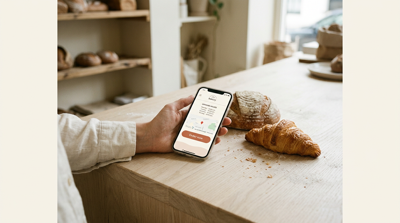
A one-page site gives visitors a streamlined user experience: everything sits in one scroll. Picture a local bakery whose single page lists its hours, menu and map. A customer on a phone finds the answer fast. Simple beats clever here.
Less content usually means faster load times. Google uses Core Web Vitals to assess aspects of page experience, including loading performance.
A research paper on quantifying user experience in web applications describes Google’s Web Vitals model, which includes these core measures.
With one page, there’s less to update, back up and fix, so upkeep stays cheap. You can refresh your hours yourself instead of paying a developer for each small change.
Most one-page layouts stack neatly on a phone, so they’re mobile-friendly with little extra work.
A single page can point every visitor toward one button. Think of a wedding photographer with one ‘Check availability’ button near the top and again at the bottom.
Visitors focus on booking rather than browsing, which can boost how many people get in touch.
Where the format falls short
- Limited space. One page only holds so much, so your story, portfolio and pricing must fit one scroll.
- Scalability and redesign needs. Adding a service later can mean reworking the whole layout.
- Slow loading from heavy visuals. Piling large photos onto one long page can drag on a phone and undo the speed you gained.
- No room for blog or service pages. There’s nowhere to publish a blog post or a dedicated page for each service, so growing later means restructuring.
Know these limits, and you’ll know when it’s time to grow.
Plan and Design a One-page Site Well
A one-page site gives visitors one scroll to decide, so planning matters more than paint.
Decide your goal and content first
Before you pick a template, write down the one thing you want visitors to do. Every section that doesn’t support that goal is a detour, so keep only the essentials.
Think of a florist who takes wedding orders. Her page leads with bouquet photos, prices and a contact form, while her garden-shed origin story sits lower down, where it builds trust without slowing anyone.
Read the page top to bottom as a story that builds toward the call to action (CTA), the button or form that asks for the step you named, rather than front-loading the ask.
Make menus and sections easy to follow
A sticky menu stays put as people scroll, so pricing or contact is always one tap away. Pair it with anchor links, which jump to a named section on the same page.
Give each section a clear heading and some breathing room. That’s visual hierarchy, the use of size and spacing to show what matters most. Let size and spacing do the guiding, not bold text on every line.
Make your main button hard to miss
Put your CTA button near the top and repeat it after key sections, like right after your pricing, so nobody has to scroll back up. Pick a color that contrasts with the background and your other buttons.
A freelance photographer with a bold “Book a session” button beside her prices gives a client who’s already sold on her rates a place to act right there. Make it obvious.
Use images and motion with restraint
Use high-quality photos, optimized so the page loads fast on a phone. Heavy files slow everything down, and a slow page sends people away before they reach your story.
Parallax (a background that moves slower than the text as you scroll) and hover effects (changes when the mouse passes over something) can look good. Use animations sparingly, and only where they draw the eye toward the CTA.
Keep colors, fonts and photos on-brand so the page reads as one business. Motion should support the message, not compete with it.
What belongs in the footer
The footer is the strip along the very bottom, where visitors look for details. Put your contact information and legal links there, such as a privacy policy and terms. Add social links only for accounts you actually use.
Consider a tutor who lists her email and phone number in the footer. A parent who scrolls down to check can call her in seconds.
The footer also supports accessibility, which means making your site usable for people with disabilities, and search engine optimization (SEO), the work that helps search engines understand your site.
Descriptive link text and a consistent business name help with both.

How One-page Websites Affect Your SEO
Search engine optimization (SEO) is how you help people find your site when they search. A one-page site can rank, but it has headwinds and strengths, so here’s what to watch and lean on.
Where one-page sites struggle in search
- Limited keyword targeting. One page can only serve so many search phrases well.
- Thin content. Squeezing everything onto one screen can leave too little for search engines to read.
- Weak internal linking. There are no other pages to link between. Anchor links that jump to a section aren’t separate URLs, so search engines still see one page.
- Fewer backlink opportunities. Backlinks, which are links from other sites, need a place to land. One page gives other sites fewer targets.
- Analytics tracking limits. Standard reports count visits to the page, not what happens inside it.
- Tracking sections with scroll events. Set up scroll tracking to see how far visitors read.
Search advantages of a single page
The upside is focus. Your page can pour its energy into one keyword set, the related phrases your customers type, so every heading points the same way. Take a wedding photographer whose single page covers packages, galleries and booking.
Every backlink lands on one address, and a couple searching on their phone finds a layout that adapts neatly to the screen. That’s a real edge.
How Google judges one-page sites
There’s no automatic penalty for having one page. Google cares less about how many pages you have and more about whether yours serves visitors well.
Core Web Vitals measure loading speed, responsiveness and stability, and mobile-first indexing means Google mainly uses the phone version of your page.
Content depth still matters: a page of slogans and a phone number rarely answers what visitors need. Substance beats slogans.
Local search gets harder on one page
Picture a bakery that delivers to three towns. One page can’t speak to all three searches, so it needs a service-location page for each town. Multi-page competitors can cover more of those searches, so you’re up against more URLs.
Keep your Google Business Profile (the listing that shows on Google Maps) matched to your site’s name, address and hours so the two support each other.
Add schema markup, a short block of code that labels those details as facts, and it works on a single page.
Habits that help your rankings
These habits help either way:
- Keyword research. Find the phrases customers actually type, then build your copy around them.
- Meta, title, header tags. Write a clear title tag (the headline in search results) and meta description (the summary beneath it). Use header tags (section labels) so each heading targets its own query.
- Image alt text. Alt text is a short description of each photo for screen readers and search engines.
- Link building. Earn links from local partners and community groups.
- Regular content updates. Refresh prices, hours and wording on a schedule.
- Set up Search Console first. Google Search Console shows which searches bring visitors. Connect it before you publish so your data starts on day one.
When to pick a multi-page site instead
A one-page site isn’t automatically bad for SEO. Multi-page sites tend to win on long-term visibility, since each new page is another door for search engines. If SEO isn’t your main goal, one page is fine.
Consider a band manager who only needs tour dates, a press photo and a contact form. One page handles all three. Match the structure to the goal, not the other way around.
Keeping the Page Fast and Phone-friendly
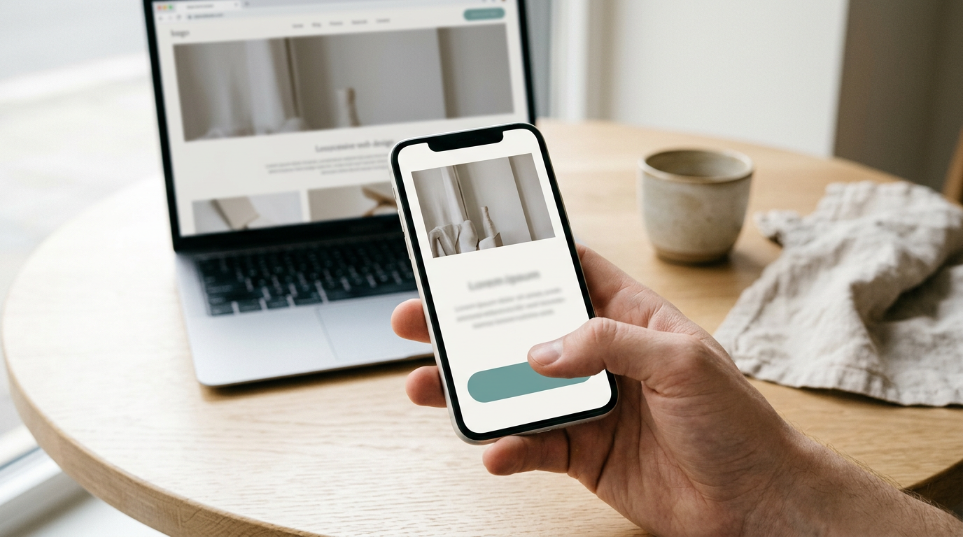
Odds are, most visitors will meet your one page on a phone, so start there.
Build for phones before desktops
According to Visual Capitalist’s breakdown of global web traffic, mobile accounted for 60.5% of global web traffic as of July 2025. So design for the phone first, not as an afterthought.
Use a responsive layout so text and images rearrange to fit any screen, and make touch-friendly buttons big enough to tap with a thumb. Check the demo on your phone before you commit.
Your phone version also matters for search, since it’s the experience most visitors have.
Compress images and test load speed
Heavy images are often what slows a page down. Image compression shrinks file sizes so pictures stay sharp but download faster. Picture a wedding photographer who uploads full-size camera files to her one page.
On a phone, the page crawls and visitors leave before seeing her portfolio. Compressed, those same photos load fast and visitors stick around.
Lazy loading helps long pages: images further down wait until a visitor scrolls near them. Check whether your theme offers it as a setting.
Speed also affects whether people stay. Bounce rate is the share of visitors who leave without engaging.
Research on perceived waiting time points to page loading time as a primary driver of bounce rates, and the effect is worse on mobile devices. Nobody waits around for a slow page.
Here’s a three-step check:
- Run your page through a free performance testing tool to see load time and the biggest slowdowns.
- Open the page on your own phone using mobile data, not home Wi-Fi.
- Fix the heaviest image first, then test again.
Examples and Templates to Start From
The fastest way to learn what to copy is to see how working one-page sites are built. Here are three types and what each teaches.
Real sites and what each one teaches
- Portfolios and agencies. A freelance wedding photographer’s one-page site might hold a short intro, recent work, and a booking form. Takeaway: put your best work and a contact option in the first screen.
- Event sites. A bakery’s holiday pop-up page lists the dates, address, menu, and an order button. Takeaway: repeat the date and place at the top and bottom so nobody has to hunt.
- Product and app pages. A candle shop’s landing page might show a hero image, three benefits, a few reviews, and a buy button. Takeaway: name the product plainly in the headline.
Choose a look first, then a builder
Decide the feel before you compare platforms. Three starting points come up most often:
- Prebuilt customizable templates. Ready-made layouts where you swap in your own text and photos. They’re the easiest start for a first-timer if you can change colors and sections without code.
- Industry-specific templates. Layouts built for one business type, like restaurants or photographers, with the sections visitors expect already in place.
- AI and drag-and-drop builders. Artificial intelligence (AI) tools draft a layout from a few questions, while drag-and-drop builders let you move blocks yourself. Either way, make sure you can still edit your text later.
Consider a retired teacher starting a tutoring blog. A clean, text-friendly template lets her spend evenings writing instead of fiddling with colors. Pick the look before the platform. Then find the builder that delivers it.
A single page can earn its place in search when it’s focused, easy to read on a phone and clear about what it offers. When your needs outgrow it, adding pages is the natural next step.
Start with one clear purpose, write real words, check the page on a phone and keep an eye on how it performs. It doesn’t need to be perfect on day one, just findable and useful.
Build that one page well, and you’ve got a foundation that grows with you.
References
- Optimizing Animation Speed: Convex Effects on Perceived Waiting Time and Digital Customer Experience — doi.org (2025)
- NEW APPROACH IN QUANTIFYING USER EXPERIENCE IN WEB-ORIENTED APPLICATIONS — doi.org (2020)
- Desktop vs. Mobile Global Web Traffic — visualcapitalist.com (2025)